In the not-so-distant past, we published the first part of the guide to the perfect landing page. We discussed what a landing page is, the various goals it can achieve, and the different uses it can have.
For those who don’t remember, you can click here to view it.
So we said that a landing page can serve various purposes – from simply conveying information to the visitor, generating leads (sales opportunities), and actually selling products. In this part of the guide, we will highlight important design elements for your landing page, what to do and what to avoid, and review some quality solutions for setting up your landing page.
Let’s move forward – to business 🙂
So, what should you pay attention to when designing your landing page?
#1 Emphasize Clear Hierarchy in the Text
We talked about this in the past in an article we wrote about typography (the art of design and text placement). Just like in a blog article or a marketing flyer, hierarchy is important in a landing page as well. It provides the visitor who enters your landing page with visual order and helps them understand the order in which to go over things.
#2 Use bold colors to call for action
In the first part of the guide, we talked about how a landing page should have one central goal that we want the visitor to perform. The remaining details are left to the form, clicking on a purchase button, downloading a file, or any other landing page goal.
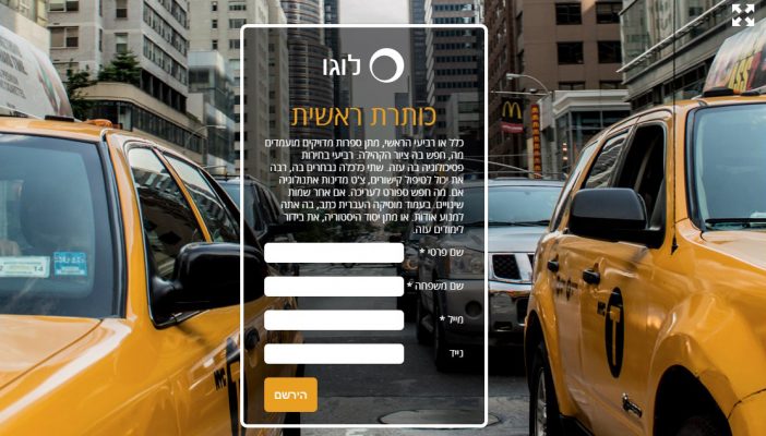
If we imagine the landing page as a funnel, this funnel converges at the point where the visitor performs the desired action – and that is the call-to-action (CTA) area. Until the CTA, we explained, described, and convinced. With the CTA, we tell the visitor, “Interested? Here’s what you need to do.”
This part of the landing page should be very prominent, in a contrasting and eye-catching manner compared to the rest of the landing page.
Let’s take a look at our landing page and see how it is expressed in action:

#3 The design of the landing page is a means, not an end
It may sound strange coming from a design and branding studio, but in the case of a landing page, we are very goal-oriented – there is something we want to achieve from the visitor, and we need to maximize the chances of it happening.
When we planned our landing page, we had all sorts of crazy and creative ideas. In the end, we went for a clean and relatively simple design that is also visually appealing.
Remember – less is more. Clashing colors, use of visual effects or various text styles make it difficult for the visitor to “navigate” through the content easily and quickly, and distract their attention.
Use the minimum design required and possible to convey your message both textually and visually, and give the visitor a pleasant and smooth experience on your landing page.
#4 Above or Below the Fold?
In the past, it was common to recommend and say that the entire landing page should be focused above the fold. What does that mean? That the user should not have to scroll down with the mouse to see all the content.
Although the fold point varies from screen to screen, it can be said that up to a height of 500 pixels, the content will likely be above the fold (if this explanation is not clear enough, please email us and we will explain this point separately).
Today’s reality is a bit more complex. With a wide range of computer screens, both desktop and laptops, and varying screen resolutions, what does that mean? It means it will be very difficult to achieve a layout where all the content fits above the fold and also has a reasonable size and proportion on as many screens as possible.
So, how do we cope?
Well, there are things that should be above the fold. Firstly, the title and subtitle of the landing page – meaning the main marketing elements that summarize the entire proposition.
Secondly, if you have high-quality sales videos or demos, it is desirable that they are available for immediate viewing upon entry. And finally, the call to action (such as a ‘Buy Now’ button or a form) should ideally appear at least once above the fold.
Alright, so we understood how to plan the landing page and what to focus on in terms of design. So what’s left? Of course, building the landing page!
There are many ways to build a landing page, ranging from very simple do-it-yourself solutions to more complex options. In this section, we will review several main methods, some of which are free and tailored for beginners with no programming or design experience, and some of which require payment and are geared towards more advanced users and larger businesses.
A marketing email delivery system whose main purpose is to send marketing emails to distribution lists, and like many other email delivery systems, over time it has begun to offer advanced features for businesses. One of these features is the ability to build landing pages in a user-friendly Drag & Drop interface, even for non-technical users.
Advantages:
– Free! Opening an account is free of charge and you can create basic and successful landing pages.
– User-friendly interface for beginners with a variety of pre-designed templates and well-constructed options for successful design.
– Immediate connection to the email system – meaning that those who register on the landing pages will be automatically added to the distribution list, and you can easily integrate email marketing activities.
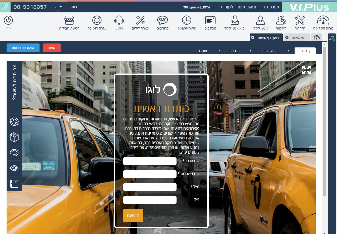
– For advanced users – you can easily connect your own domain to the landing page! For example, we created a sample landing page at: http://vpland.zis.co.il/test
Disadvantages:
– Design is limited to existing templates and modules, so in this case, there is a limit to imagination, although it is quite extensive.
– Free usage is limited to up to 200 registrations, after which you need to join one of the paid packages.
Company website: http://www.viplus.co.il
Advantages:
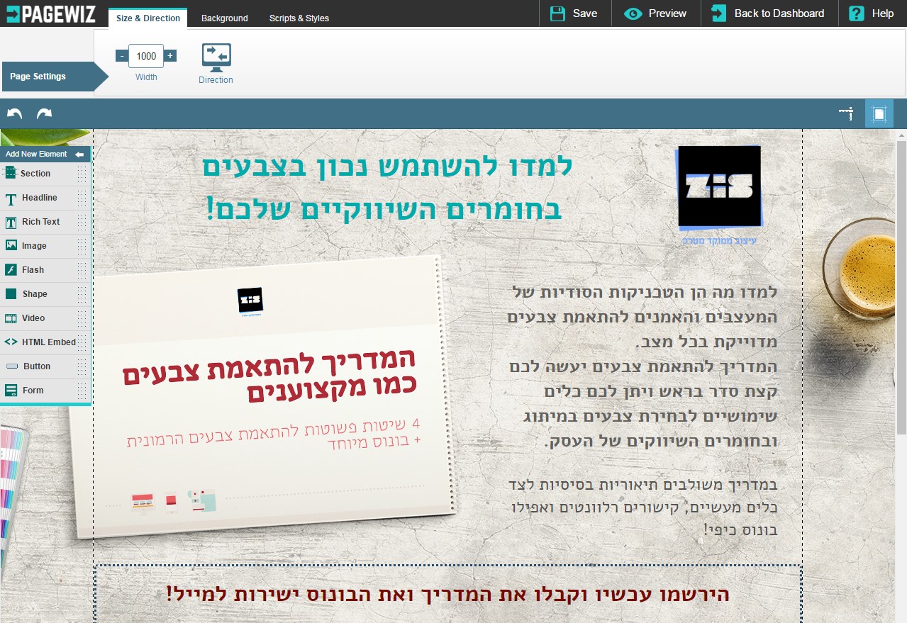
– One of the most advanced systems in the country for building landing pages, with almost infinite flexibility in design and structure, with a user-friendly and intuitive Drag & Drop interface.
– The system does not limit you to a specific email or customer management system and allows integration with any system you want, in addition to the standard function of receiving leads by email.
– Full control over the design of the landing pages, including responsiveness to mobile devices.
– Excellent Israeli support, in Hebrew of course, with quick responsiveness to any help request and a willingness to solve problems quickly. The company also manages a dedicated Facebook group for supporting system users.
– You can also connect your own personal domain to your landing pages for perfect branding. Note – our landing pages in the studio are built on this system.
Disadvantages:
– The system is a paid one, starting at 120 ILS per month. There is an option to try the system for free for 30 days, but to continue using it, payment is required.
– As mentioned, the system offers amazing flexibility in building landing pages, but also requires a certain knowledge of programming for embedding more advanced components or complex designs, making it more suitable for advanced users.
Company’s website: http://pagewiz.com
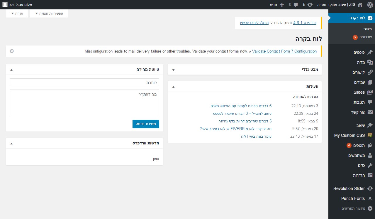
For those who are not familiar, WordPress is the most popular and beloved content management system (CMS) in the world for managing content on websites. About 70% of websites worldwide are built on this system. Originally built as a platform for building blogs, today it is used for building all types of websites, including landing pages.
Advantages:
– User-friendly and easy-to-use content management.
– Very easy for technical professionals who know how to build websites and landing pages using the system to assist with its operation, and relatively easy to learn to use it properly on your own.
– The system has a remarkably simple plugin store that allows you to easily add advanced components.
– Although building a WordPress-based landing page may require both design and development services, the sky is the limit here. No matter how bold, unique, or complex your design and intended layout for your landing page, it can be done.
– WordPress-based landing pages can be set up independently on the international website wordpress.org or on your own personal domain with website hosting.
Disadvantages:
– The system is complex and requires the use of design and development services for setup, in addition to separately purchasing hosting for the landing page. This means that building and maintaining a WordPress landing page will be noticeably expensive in the short term compared to other solutions.
– As mentioned, you can design and implement almost anything you want, but not in a simple and independent way (unless you have the required technical knowledge). Significant changes in the structure or design of the landing page may require coding and customization.
– WordPress is an open-source platform, which means that it requires regular updates and security measures to keep it safe and up-to-date, which may require technical expertise or additional services.
In conclusion, WordPress is a widely used and powerful CMS for managing website content, including landing pages. It offers many advantages in terms of user-friendly content management, flexibility, and customization options. However, it also has some disadvantages, such as the need for technical expertise for setup and maintenance, and potential costs associated with design, development, and hosting.
Here concludes our guide to the perfect landing page. Remember that with time comes experience, and the more you try different systems and solutions, and work according to the principles we discussed in the two parts of the guide, the better you will improve over time and achieve impressive results!
Good luck!