Rut’s Chocolate
Logo and Package Design
For over eight years, ZIS had the pleasure of working with Ruth on developing her brand. Over time, she created a line of chocolate products that became so unique and distinguished that it needed to be branded separately. However, we still wanted to maintain the element of personality that made her main logo recognizable.
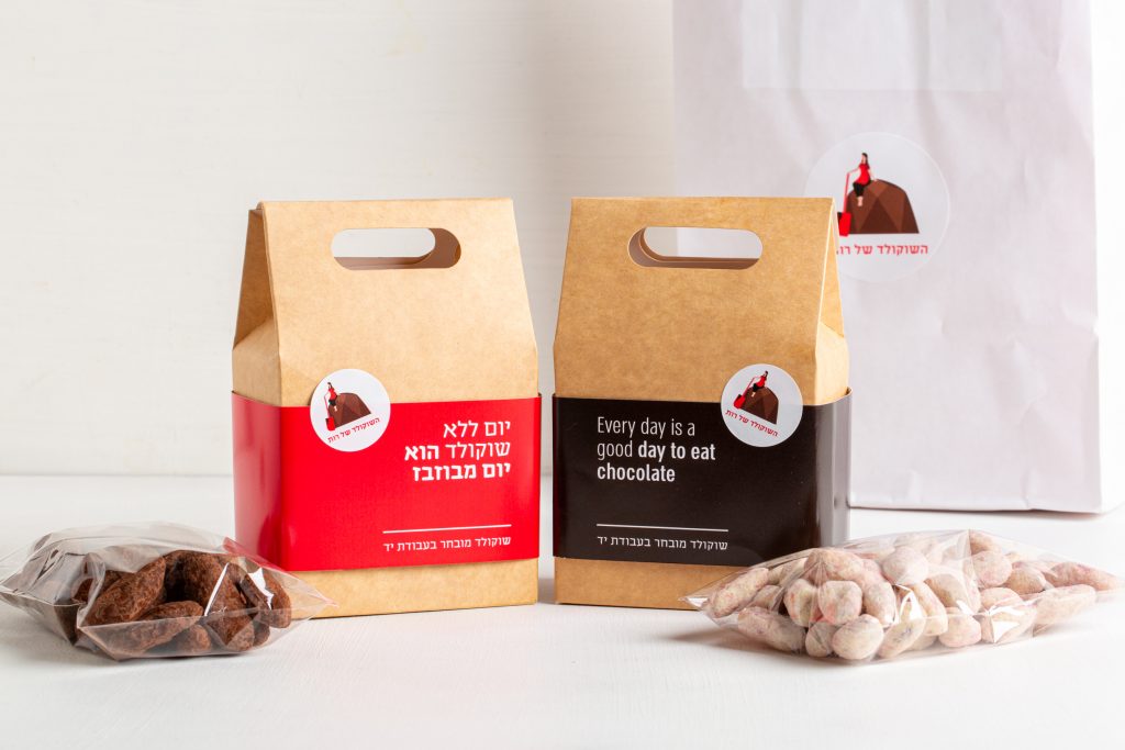
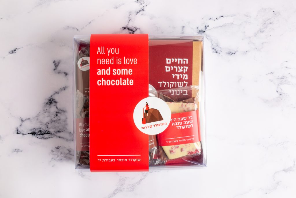
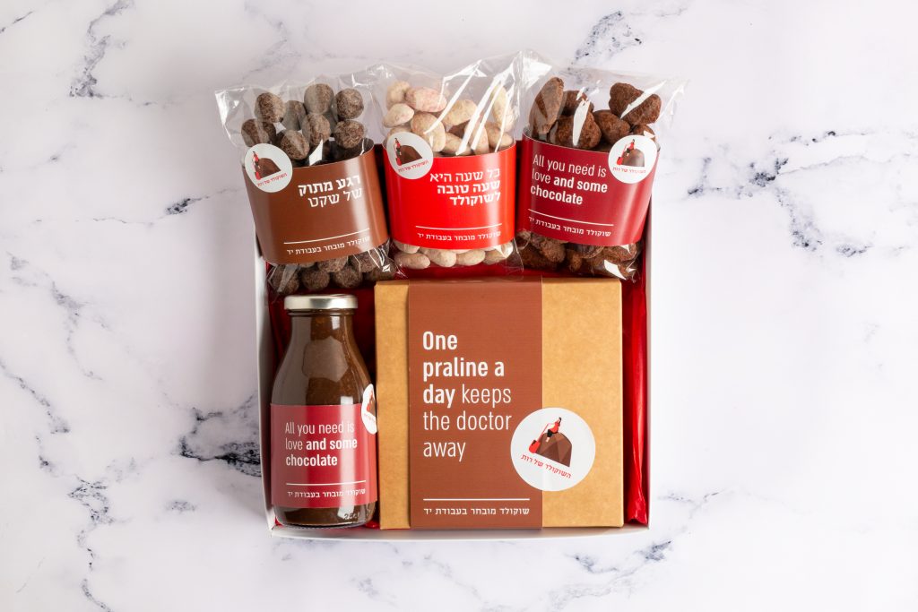
To create the chocolate brand logo, we designed a praline icon with Ruth sitting on top of it, holding a spatula, to convey the idea of hand-made chocolate made with care. The goal was to make it clear from afar that it’s a chocolate brand.
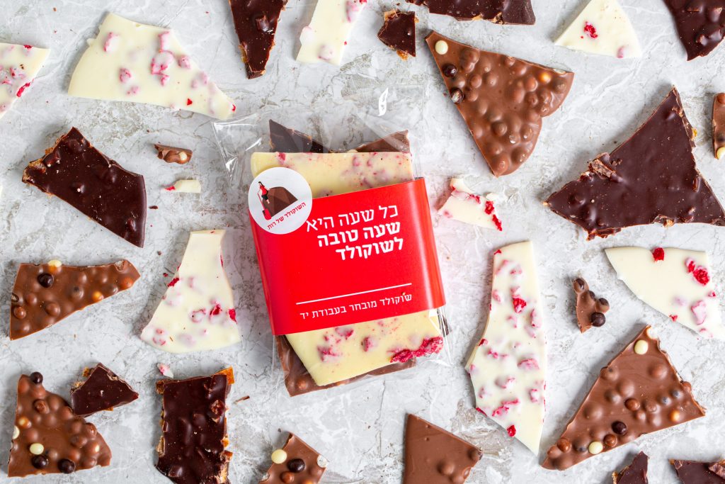
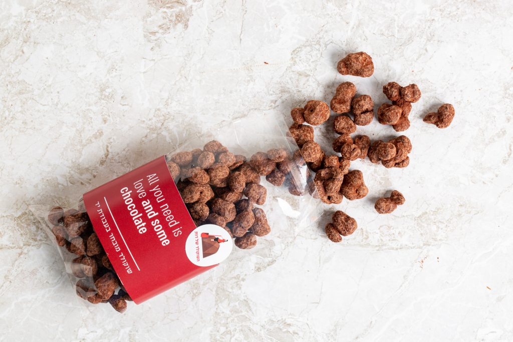
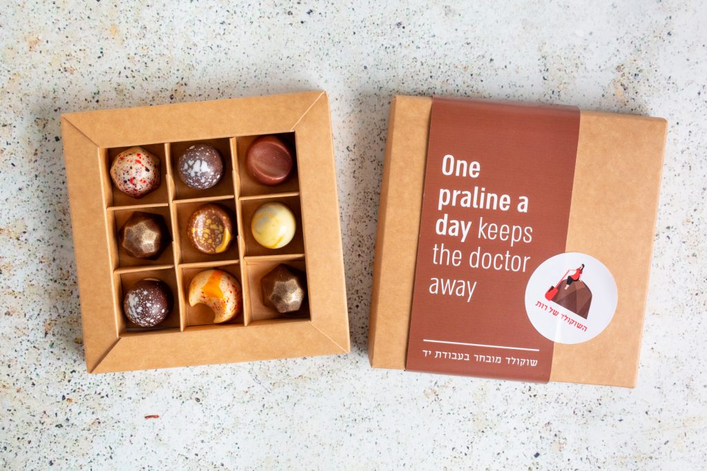
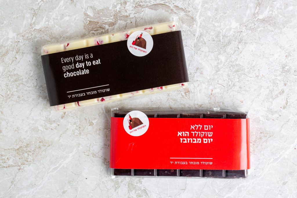
For the packaging design, we wanted to maintain Ruth’s existing brand color – red, but opted for a minimalistic, solid color strap with a fun chocolaty quote that goes on a raw package. To top it all off, we added a round white sticker with her logo to complete the look.
To see Rut’s Confectionery branding page, click here.
Photography: Alona Lahav
