It seems like everyone is talking about landing pages these days.
Every campaign needs a landing page, every business needs a landing page, there are workshops on how to create them, and there are countless systems for building landing pages.
It can be a bit overwhelming with all this buzz.
So, we decided to sort out the mess and start from the beginning – what is a landing page in the first place? Why do we need it? And how do we design and develop an effective landing page that engages visitors and yields results?
To make it easier for you, we’ve divided this guide into two parts. In the first part, we’ll review some basic concepts – what is a landing page, why do you need it, and what should be included in it. In the second part, we’ll discuss design considerations, recommended tools for building landing pages, and other tips to make your life easier.
Let’s get started!
What is a landing page and why is it beneficial?
A landing page is a web page that a visitor arrives at after clicking on a link of some kind – it could be a paid advertisement on Google or Facebook, an organic search result, a link sent via email or message, or any other way that drives traffic less organically (which is actually very important right now). The key is that it’s the page where the visitor “lands” after being directed to it to receive information about something.
A landing page can be a specific page on your website, or it can be a standalone page that contains a highly focused and specific offer, depending on your needs and what you want to promote.

The most common use of a landing page is for lead generation – collecting information of visitors directed to the landing page through a paid advertisement who are interested in our product or service and want us to contact them regarding their inquiry.
Of course, a landing page can serve many other purposes – registration for a conference or event, online product sales, signing up for a newsletter, or any other business objective.
One last important thing about a landing page, any landing page for that matter, is that statistics show that the average time a visitor spends on a page is 8 seconds. Yes, only 8 seconds to make enough impression on them to make them stay (some may argue that this time has shortened to 2 seconds, but for now, let’s stick with 8). What does that mean? It means that if our landing page is not precise, our chances of success may not be particularly high. Now let’s get into the details.
Now enough with terms, let’s get to the point.
For simplicity’s sake, a landing page, whether standalone or within a website, is essentially a digital flyer. It outlines an offer of some sort in a way that intrigues the visitor and prompts them to take action – leave their details or make a purchase/registration – and provides them with the means to do so.
Clear objective – Why did you bring me here?
Yes, the visitor clicked on an ad, but now they have arrived at the landing page and it should be clear to them from the beginning why they are there, what we are offering them, and what is required of them to do. It could be interest in a purchase by leaving their details, signing up for additional information by email, proceeding to the next step in a registration process, or any other desired action. It is important to have a clear and compelling call to action (CTA) that directs the visitor towards the desired outcome.
The acronym AIDA represents 4 words:
- Attention/Awareness – creating awareness and grabbing attention
- Interest/Information – generating interest and providing information
- Desire/Decision – creating desire and influencing decision-making
- Action – prompting action
This model, used by marketers and advertisers for over 100 years, represents a simple sequence of events. First, we capture the user’s attention and create awareness of our offering.
Once we have their attention, we provide them with information and generate interest.
Then, we encourage them to make a decision, so that ultimately they take the action we want them to take.
Sounds simple, right?
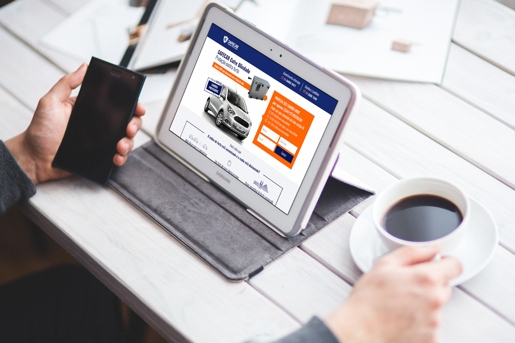
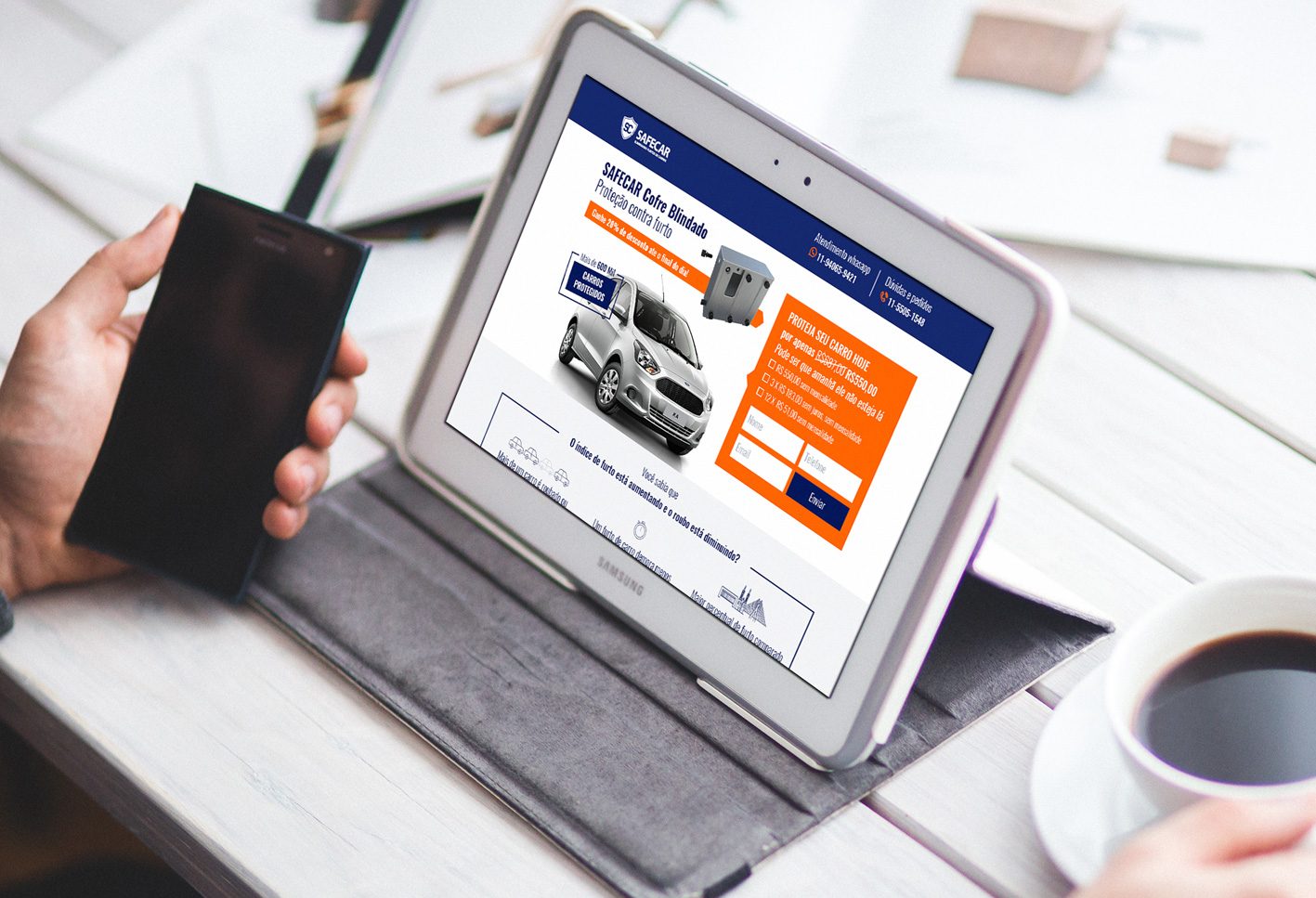
Now let’s understand how this translates to a landing page and demonstrate it by breaking down our landing page, which we presented to you earlier, into its various components.

An important point regarding this is the simplest way to capture the visitor’s attention is through what is called a “Pain Point” in English. It may sound a bit extreme, but the meaning is simpler – the visitor came to us hoping to find a solution to a specific “pain” or need. If you sell toasters, and you advertise a toaster that promotes your product, there’s a chance that their toaster just broke and they need a new one. That’s their pain… they don’t have a toaster. Understand the point? So if your main headline addresses the pain point you identified in your target audience, the chances of keeping them engaged are higher. If you want a live example, just listen to radio commercials, because almost every ad there is a short formulation of a pain point and the solution to it (Want to learn a sought-after profession? X studies at Y College, for example).

Note – We mentioned the Pain Point earlier. This is exactly the place to expand on how your product or service is the perfect solution to that pain point that you defined at the beginning.

Depending on the product you are promoting, you can use different techniques to increase the user’s desire to make a decision now. For example, you can mention that “the number of spots is limited” or “limited stock remaining”, or indicate that “registration is about to close” and so on. You can also offer a specific incentive for quick decision-makers, such as “an additional 10% discount for those who register now”.

Significant importance lies in this area, known as “Call to Action” or CTA – one of the most talked-about terms in the digital marketing world. The call to action should be clear, prominent, and highly attractive.
Our landing page was relatively simple, and the action we requested from visitors was relatively minor – fill the form in order to get a discount.
Depending on the complexity of the product you are promoting and the type of audience you are bringing to the landing page, you will need to make important decisions such as how prominent the call to action should be at the beginning of the page, or how much and what type of information to provide in the second part.
There can also be more complex combinations that cut some of the information giving section – the Interest/Information – through a call to action, in order to prevent those who have already been convinced at this stage from getting tired and overwhelmed by information overload and making the decision at an earlier stage.
There can be long and information-rich landing pages, where the registration form or payment button can appear multiple times throughout the landing page. What is interesting about these landing pages is that they are actually divided into sections, each one restarting the AIDA sequence with the expansion of the information given in the previous section.
Next week we will review in depth the emphasis on landing page design, inspirational ideas for winning headlines, and also recommend successful systems that will make it easier for you to create excellent landing pages.


