Wikimedia
Website and Landing Pages
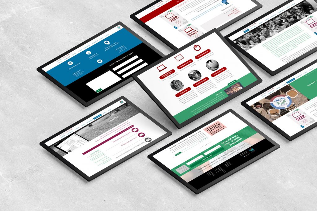
The Wikimedia project involved two major design components: renewing the main website and creating a new graphic language for the organization. The website update included fresh imagery and a fun icons language that would be used throughout the site. This redesign aimed to maintain the recognizable brand colors, but to modernize the look and feel of the site while also making it more user-friendly for visitors.
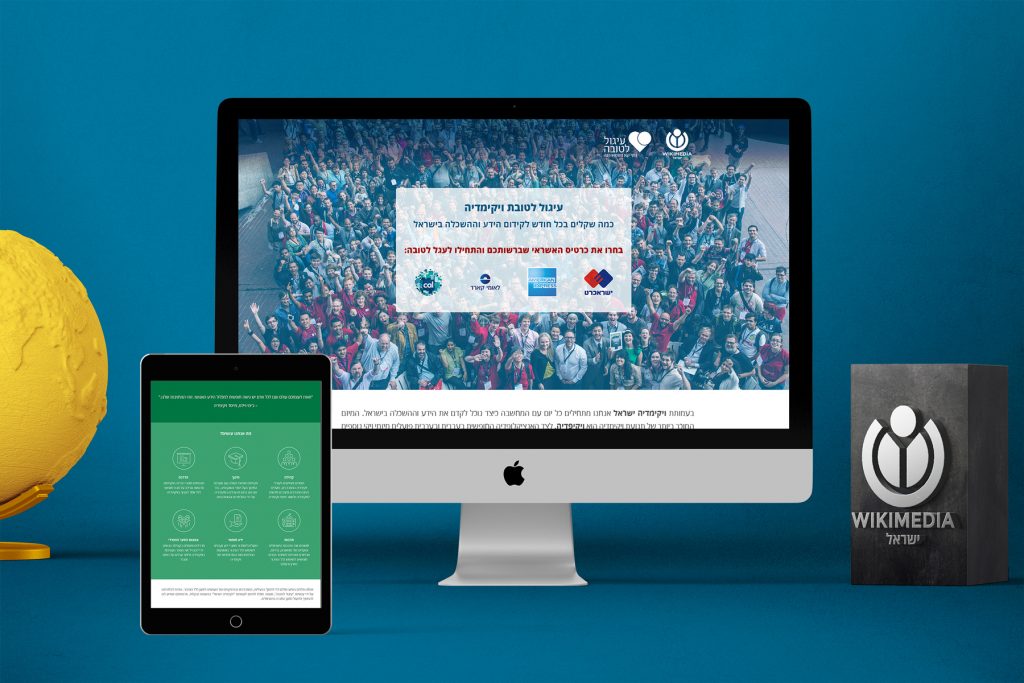
In addition to the website updates, a landing page was designed to promote collaboration between Wikimedia and “Igul Le’tova”, a platform for registration and contribution. The landing page design was intended to make it easy and convenient for users to sign up and contribute to Wikimedia’s mission.
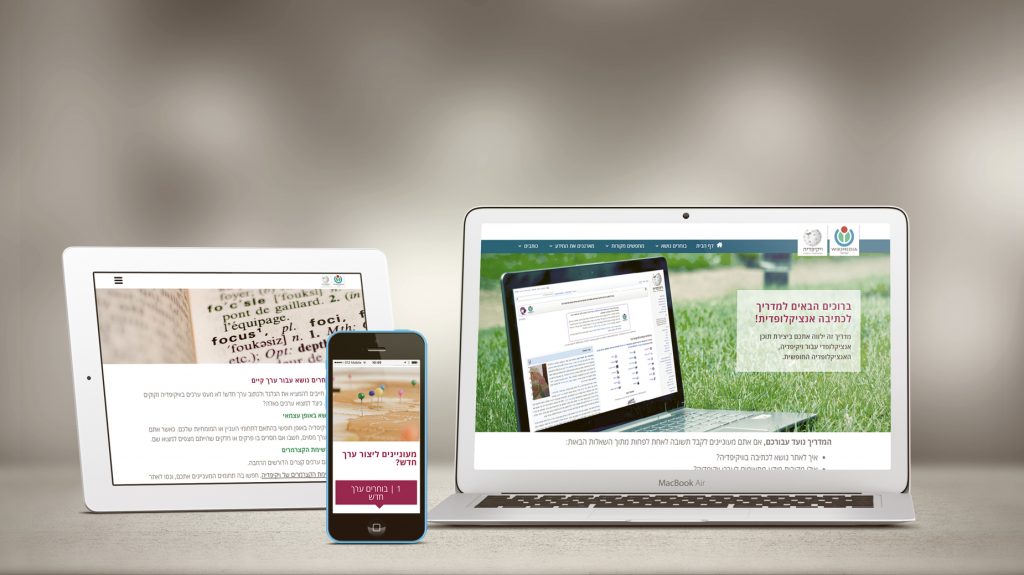
Finally, an online tool was developed to teach users how to create or enrich Wikipedia entries. The tool was designed to be intuitive and user-friendly, with step-by-step instructions that would guide users through the process of adding or improving content on the site. The tool was an important part of the organization’s mission to encourage greater participation in the creation and sharing of knowledge.
